Talking Points
- The 5-year Wedge
- Pending Breakout?
- Key Levels Ahead
US Oil and UK Oil or Crude & Brent have been unexciting on a long-term chart since 2009, but that could change rather drastically in the near future given a few fundamental and technical developments. Recently, we’ve seen other commodities like Gold show up with very bullish moves. Given the wedge patterns across many commodity crosses, these moves are a breath of fresh air.
The Multi -year Wedge
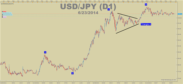
If you’re unfamiliar with a wedge pattern, here’s a quick breakdown. A wedge or triangle is a technical pattern that often precedes a thrust in the direction of the prior trend. USDJPY printed a heavily watched triangle from May ’13-Oct ’13.
Learn Forex: USDJPY Triangle Followed By Thrust Higher
Presented by FXCM’s Marketscope Charts
The chart above should make you familiar with two things. First, that triangles exist as a corrective move against the overall trend. Second, when a triangle expires, a move higher is often the result. Now, let’s look at both UKOil & USOil
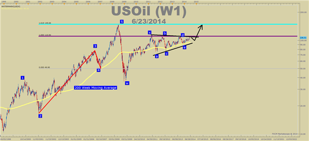
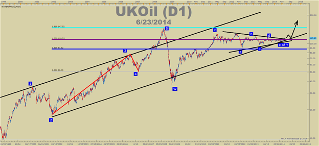
Learn Forex: Triangles Triangles Everywhere
Presented by FXCM’s Marketscope Charts
Presented by FXCM’s Marketscope Charts
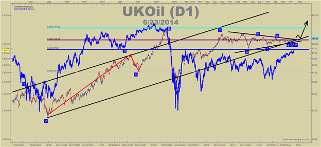
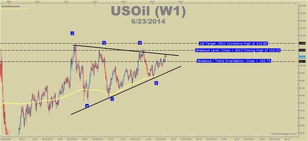
UK Oil looks a little cleaner for an upside push should the triangle play out as presented. However, each chart shows a triangle in play since 2011 and a correction that started in 2008, potentially coming to an end.
Pending Breakout?
By looking at the larger picture, both USOil & UKOil could be on the verge of a breakout due to exhausting triangle patterns. In order to validate the breakout, we can look to correlated markets to see if their also on the verge of a breakout. In the world of currencies, we have noticed a positive correlation to GBPUSD & UKOil.
Learn Forex: GBPUSD Overlaid on UKOil
Presented by FXCM’s Marketscope Charts
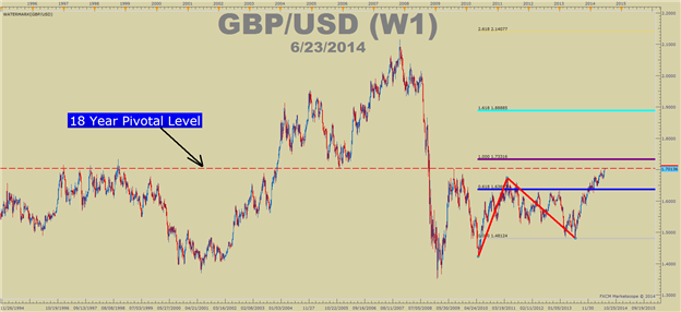
GBPUSD overlaid on UKOil shows a rather clean correlation. In other words, when GBPUSD moves down significantly, so does UK Oil and vice versa. Looking to a long-term GBPUSD, a break-higher from a 5-year correction could be upon us and if that’s the case, the correlation just shown would argue upside in UKOil & likely US Oil.
Learn Forex: Long-term GBPUSD Chart
Presented by FXCM’s Marketscope Charts
The red line on the chart sits around 1.7046 anchored to the pivotal corrective low in 2005 before hitting a top price of 2.1160. That level was also the corrective top in 2009 and a triple top level in the late 1990’s. If the market does have a memory and the 1.7040 level doesn’t hold GBPUSD down, then a move higher could be in store and correlations could take Oil with it.
Key Levels Ahead
US Oil is pushing long-term resistance now and could have a hard-time without a boost from a weaker USD . Last week, Janet Yellen seemed to show the Fed as a non-threatening central bank to those fearing an abrupt hawkishness at this stage. If the Fed’s tone remains the same for the foreseeable future, that could favor a weak USD and stronger commodities.
Presented by FXCM’s Marketscope Charts
Indicators like Ichimoku show the Oil is gearing up for a strong move. However, in the end it’s best to look for a key price-action level to give before definitively looking for a breakout.
If you’re unfamiliar with looking for price action breaks as a way to look to price action alone for trading signals, you can learn more about trading Price Action signals by registering here for our FREE online course here .
Now that you know these key levels on US & UK Oil, feel free to test them out on a free FXCM UK Demo account.
Happy Trading!
---Written by Tyler Yell, Trading Instructor
To contact Tyler, email [email protected]
To be added to Tyler’s e-mail distribution list, please click here
Tyler is available on Twitter @ForexYell
Add me to your Google+ Forex Circle